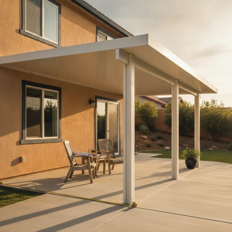

An Anaheim Hills homeowner called us last month with a problem that had nothing to do with structure. She had already picked her cover: a solid-roof aluminum patio cover, 10 by 20 feet, over a west-facing slab. What stalled the project was color. Her house is warm beige stucco under a clay S-tile roof, and she was staring at a fan deck of powder coat samples with no idea which one would look right bolted to her back wall.
That hesitation is smart. A patio cover is not a throw pillow. The finish you pick gets baked onto the aluminum at the factory, and it will face July sun in Orange County for 20 years or more. Repainting later is possible but rarely looks factory-clean. So the color call deserves the same attention as the beam span. Here is how we walk homeowners through it at the kitchen table.
Start With the Colors You Cannot Change
Every stucco-and-tile home in SoCal already has a fixed palette. The stucco field color, the roof tile, the window frames, the garage door, and the hardscape are all staying put. Your cover has to live with them. Before you look at a single sample card, stand in the backyard and write down those five elements. In most Inland Empire and OC tracts you will find beige or greige stucco, a red-brown or terracotta blend tile, and either white vinyl or dark bronze window frames.
The window frames matter more than most people expect. A cover picks up its visual cues from the nearest architectural metal, and that is almost always the windows and sliding door. Dark bronze frames pair naturally with a dark bronze cover. White vinyl frames make a white or almond cover read as intentional. When the cover metal and the window metal disagree, the backyard starts to look like two different remodels that never met.
Exterior designers are saying the same thing this year. The 2026 trend reports from paint and window manufacturers keep landing on warm neutrals, creamy whites, greige, and muted earth tones for stucco homes, with matte black and dark bronze holding strong for accent metals. That maps almost perfectly onto the standard aluminum cover palette, which is no accident. The industry built those stock colors around SoCal housing stock.
Match, Blend, or Contrast: The Three Plays
The first play is the match. You pick a cover color that sits as close to the stucco field color as the fan deck allows, usually a desert sand, almond, or latte tone against beige stucco. Matching is the safest call for an attached cover because the structure reads as part of the house rather than an addition. It is also the fastest through HOA review in planned communities from Ladera Ranch to Eastvale, since architectural committees approve continuity without much debate.
The tradeoff is that a matched cover disappears. Some homeowners want exactly that. But if you are proud of the new structure, a perfect match can feel a little flat, and lighter field tones show dust and drip lines more readily than mid-tone finishes do. You give up presence to gain calm.
The second play is the blend. You ignore the stucco and key off a secondary fixed element instead, most often the window frames or the roof tile. A dark bronze cover under a terracotta roof with bronze windows is the classic SoCal blend, and it hides water spotting far better than white. The cover stands out just enough to show off its lines while still belonging to the house. This is the play we recommend most often on stucco-and-tile homes built after 2000.
The third play is contrast. Think a charcoal or matte black cover against light stucco. The 2026 pergola market has moved hard in this direction, and on the right house it looks sharp and architectural. The gamble is bigger, though. Dark finishes run hotter to the touch on the posts, show pollen and hard-water residue, and some HOAs in older OC communities will push back. Contrast rewards a modern elevation and punishes a traditional one. If your home leans Spanish or Mediterranean, blend beats contrast almost every time.
The Powder Coat Spec Behind the Color
Whatever tone you choose, ask what is actually holding that color onto the metal. Aluminum patio covers carry a factory-applied powder coat rated under AAMA standards. AAMA 2603 is the entry tier and will chalk noticeably within 5 to 10 years of direct SoCal sun. AAMA 2604 holds gloss and color for roughly 10 years and suits most inland installs. AAMA 2605 is the coastal tier, built to resist salt air and UV for 20 years or more, and it is what we spec within a few miles of the water in Newport, Huntington, or Carlsbad.
The spec matters more on dark colors than light ones. A faded almond still looks like almond. A faded charcoal looks gray and patchy, especially on the south and west faces of the cover. So if you choose the contrast play, budget for the higher coating tier and confirm it in writing on the quote. A typical 10 by 20 attached cover here runs a 3 by 8 inch extruded aluminum beam across the front with posts at 10 to 12 foot spacing, and every surface shows the finish at eye level. Color quality is not a detail you can hide.
One more option worth knowing: embossed wood-grain finishes. These give you the warm cedar look that pairs well with earth-tone stucco, without the sanding and restaining a real wood pergola demands every couple of years. On a stucco-and-tile home the wood-grain aluminum reads as a deliberate craftsman touch, and it has become one of the most requested finishes on our OC installs this summer.
Test Swatches in August Light, Not Showroom Light
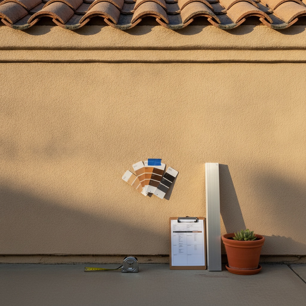
Showroom lighting lies. A sample that looks warm under fluorescent tubes can go cold and green in open shade under a marine layer. Get physical sample cards from your contractor and tape them to the actual wall where the cover will attach. Look at them at 9 in the morning, at 3 in the afternoon when the west sun is hammering the slab, and again at dusk. August light in SoCal is about as harsh as your cover will ever face, which makes this month the honest audition.
Check the samples against the tile roof line too, not just the stucco. Hold the card up at arm’s length so you see stucco, tile, and sample in one view. Colors that flatter the wall can fight the roof. And if you are in an HOA, photograph the taped-up samples against the house. That photo, plus the manufacturer color name, is usually most of what the architectural application requires.
Color is the decision you will look at every single day, and it costs nothing extra to get it right at the start. If you are weighing sample cards against your stucco right now, we will bring the full fan deck, the AAMA spec sheets, and 20 years of local color calls to your backyard. Request a free in-home quote from JNL Aluminum and we will help you land on the finish that still looks right in 2046.
Morning-context sources used: https://www.milgard.com/blog/exterior-home-color-trends-2026, https://tricopainting.com/best-stucco-house-colors-for-2026/, https://topopowder.com/en/blog/colour-trends-in-powder-coatings-2026/, https://struxurenorcal.com/blog/pergola-trends-2026-outdoor-living-design/, https://azenco-outdoor.com/patio-cover-colors-for-modern-home/, https://royalcovers.com/alumawood-patio-cover-color-combinations-for-modern-homes/